Steel Makeovers: 5 Mecha Character Redesigns That Reshaped Gaming History
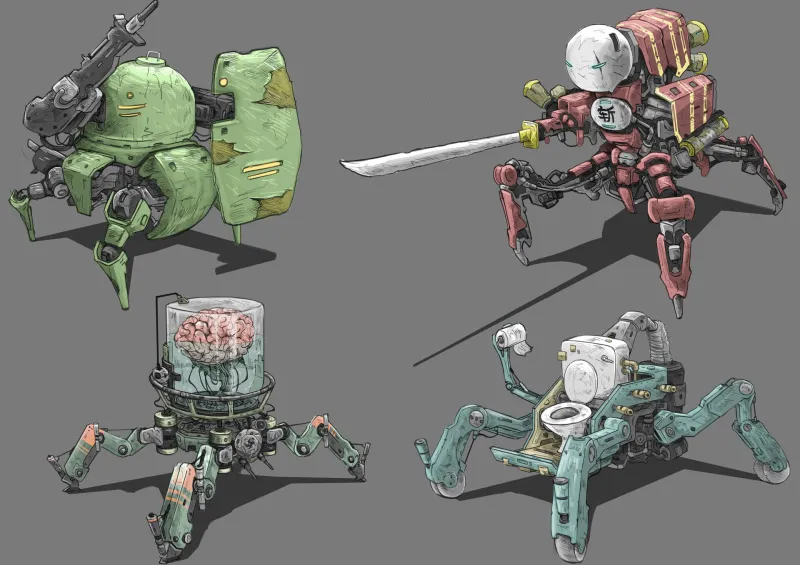
Photo: mecha robot character concept art redesign comparison gaming, via cdna.artstation.com
Redesigning a mecha character is basically defusing a bomb in front of a crowd of very passionate people holding very strong opinions. The silhouette is sacred. The color scheme carries memories. The proportions communicate personality in ways fans have internalized over years of manga panels and anime episodes. Change too little and you've wasted the opportunity. Change too much and you've started a war.
And yet, some redesigns don't just survive the backlash — they actually improve everything. Gameplay gets sharper. Competitive scenes get deeper. Fan communities find new reasons to argue passionately about something they love. Here are five redesigns that genuinely moved the needle.
1. RX-78-2 Gundam — From Toy-Shelf Proportions to Combat-Ready Icon
Before: The original RX-78-2 as it appeared in early Gundam game adaptations was largely faithful to Yoshiyuki Tomino's 1979 anime design — chunky, colorful, almost toy-like in its proportions. It was charming precisely because it looked like something a kid would draw.
After: When Bandai Namco began iterating on the design for the Gundam Versus competitive series, the silhouette got leaner, the joint articulation became more visually pronounced, and the color contrasts were sharpened to read clearly in fast-paced multiplayer environments.
Why It Mattered: The redesign wasn't cosmetic — it was functional. A mech that reads clearly at high speed during a competitive match is a mech that players can track, predict, and respond to. The updated RX-78-2 became the visual benchmark that other units in competitive Gundam games were measured against. It also made the character feel genuinely heroic rather than nostalgically retro, which opened the door for new American fans who hadn't grown up with the original series.
2. Evangelion Unit-01 — Psychological Horror Becomes Playable Aggression
Before: In the Neon Genesis Evangelion source material, Unit-01 is deliberately unsettling. Its proportions are wrong in subtle ways. Its face is mask-like and alien. It's designed to make you feel uneasy about what's actually inside that armor.
After: For gaming adaptations — particularly crossover titles and fighting games — Unit-01 was subtly regularized. The proportions moved closer to a conventional super robot. The color contrast between the purple armor and green trim was intensified. The face retained its strangeness but became more readable as a "cool" design rather than a horror element.
Why It Mattered: This redesign fundamentally changed how Western audiences related to the character. In the anime, Unit-01 is something to fear even as you root for it. In gaming contexts, it became something to want — a power fantasy avatar with just enough weirdness to feel unique. The competitive community built around Eva characters in crossover fighters owes a lot to this shift. Players chose Unit-01 not because they understood the existential horror underneath, but because it looked and played like a winner.
3. Jehuty from Zone of the Enders — Anime Abstraction Meets Western Action Game
Before: Jehuty's original design by Yoji Shinkawa was aggressively abstract — elongated limbs, minimal surface detail, a face that suggested presence without literally depicting one. It was a design that made sense in motion and almost none at all in a still image.
After: The HD Collection and subsequent promotional materials refined Jehuty's surface texturing and sharpened the lighting model to give the frame more visual weight. The design became easier to merchandise and easier to read for players who hadn't grown up with the original PlayStation 2 release.
Why It Mattered: Jehuty's redesign is a case study in the tension between artistic integrity and accessibility. The original design was a masterpiece of suggestion. The refined version is a masterpiece of communication. For American audiences discovering the franchise through the HD re-release, the updated Jehuty was an immediate visual hook. It helped a cult classic find a second audience and reminded publishers that thoughtful visual updates — not reboots — can revitalize a dormant franchise.
4. Heavy Arms (Gundam Wing) — Maximalism Gets a Competitive Tuning
Before: Heavy Arms in the Gundam Wing anime is a maximalist fantasy — a machine literally covered in weapons, designed to communicate overwhelming firepower through sheer visual density.
After: For competitive gaming adaptations, Heavy Arms underwent significant silhouette simplification. Redundant weapon clusters were consolidated. The overall frame was given cleaner lines so that the character's attack animations could be read clearly against complex backgrounds.
Why It Mattered: This redesign revealed something important about the gap between anime design and game design. What works as a symbol of power in a dramatic freeze-frame doesn't always work as a playable character in a fast-moving match. Heavy Arms' competitive redesign made it genuinely viable in tournament play and sparked conversations in the mecha gaming community about how much visual complexity a character can carry before it becomes a liability rather than an asset.
5. Armored Core's Generic AC Frame — Modular Design as Character Identity
Before: Early Armored Core titles gave players modular mechs but limited visual language to make their builds feel like genuine characters. The parts were functional. The personality was mostly mechanical.
After: Armored Core VI: Fires of Rubicon introduced a redesign philosophy that treated the default AC frame as a genuine character canvas — with proportions, color systems, and decal tools sophisticated enough that player-built machines developed real identity and community recognition.
Why It Mattered: This is the most radical redesign on the list because it's a redesign of the concept rather than a specific character. By making the player's own mech feel like a real protagonist, FromSoftware created a competitive and community scene where custom AC designs became recognizable personalities in their own right. American streamers and content creators built audiences around their specific builds. The redesign turned a mechanical system into a cultural one.